🎉 Celebrating 25 Years of GameDev.net! 🎉

Not many can claim 25 years on the Internet! Join us in celebrating this milestone. Learn more about our history, and thank you for being a part of our community!

Character art compared to background scene

Started by
13 comments, last by A_Mc 5 years ago

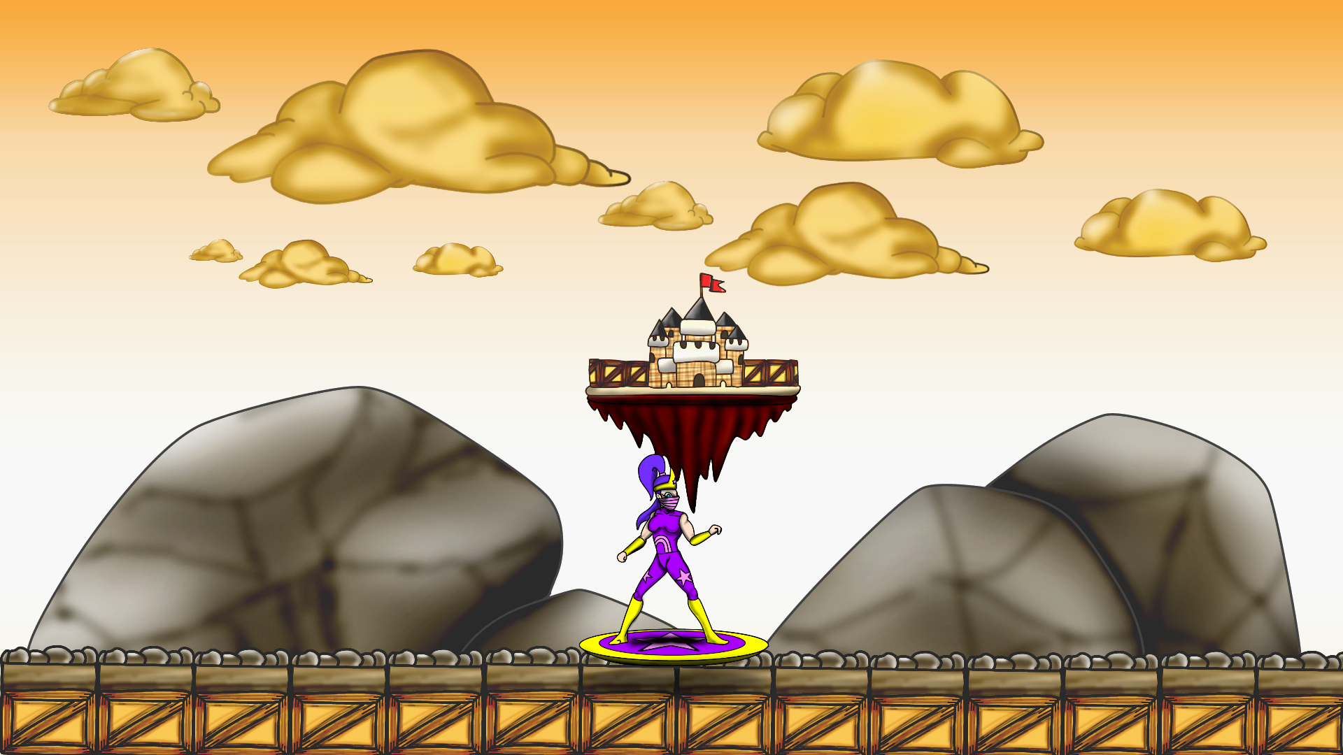
@Kryzon thanks for that, I completely understand what you mean about the sharp/soft shading and was actually looking over that the past couple days. I didn't use an air brush but I did smudge a darker colour over the top which ultimately rendered a similar effect. Definitely over using that shading technique can leave you with a blurry image none the less.

Fundamentals are definitely something I'm coming to terms with as I'm progressing. 


@a light breeze thanks also! So, I understand my character has no elements of shading or shadows which would actually enhance the scene way more. My issue was probably the fact that I didn't care to add any shading or shadow. (I'm drilling myself now to stop being lazy!)

the other two things you mentioned are great ideas which I'll give a go! I like the thought of a light from a constant direction and adding foreground shading! 


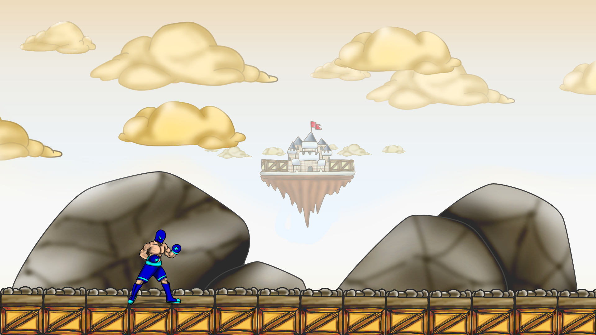
@tyree another thanks! I took your advice but didn't like having black lines around my background images almost like a stroke. I stole that technique from someone in my class and I liked it lol I'm just not pulling it off too great at the moment. I'll still play around with the idea though 'cause you never know !

Advertisement

Tried some really quick air brushing on the character. Need to practice more with soft and sharp shading. I done another image to try different things but definitely need more practice still.

I realised you have to do the things you don't want to do, to achieve the results you want.

Time is art haha

1DB38CB0-2308-48A6-BE3C-C0C2D0EBBFA8.png

9BF3D2E5-6CFE-44D3-BB85-B1A7A845D02C.png

You might want to add a shader over the background to make it lighter to distiguish it from the foreground. Best in multiple layers. So the clouds are the brightest etc. Gives it a certain depth and the player knows by intuition which objects are where on the layers of the game. 

@A_Mc I was thinking about how I could approach that! I had a test but don't know how transparent the filters should be or if i should be filtering the whole canvas?

5082DA91-072A-46D7-8DD4-60423B972788.png

CD78E4AB-A9D3-49AB-BEA6-9D91405DBD74.png

Go by the order of distance. Everything you can walk on or is in the front gets no filter at all. the rocks in the back get like 10-20% the clouds and castle 25-35% and so forth. Test it until you find the best solution but remember to give the rocks some filter too. They might mislead the player to jump on or other options. you need to give a clear intuitive view on the level, to the player.

This topic is closed to new replies.

Advertisement