Nice drawing, the pause is quite lively, which is quite cool.
I can make one criticism : try to use the rule of "Warm Foreground, Cold Background" to give the picture more depth. For instance, you could put the shirt in a more reddish hue, to spearate it more from the flag.
Another cool thing you can do if you want to give a nice finish to the picture, is to smoothen the lines. I assume that you had the good idea to separate all your different parts in different layers, and that the line drawing in B&W is on his separate layer. If so, try this :
On the lineout layer, use a Gaussian Blur, around 3. Then use the Adjust / Curves. What you want there, is to get an almost Black or White setting. To do that, set the values under, say 128, to 0, and those above 128 to 255. You get a curve that wont be a straight line anymore, but more like that ___|"""
ok ?
And there you are, your lines will look much cleaner.
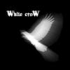
Here''s an example (*BRAG ALERT*)

Originally, the sketch on paper is 3 inches high, and the scanning would show all the defaults of the drawing, because of the zooming in I did. So I used the above method to get a cleaner lineout, it looks more like felted marker now.
Good luck :-)
-----------------------------Sancte Isidore ora pro nobis !

 My team mate sent this sketch to me, I cleaned it up a little and darkening the lines
 Durring Production
 The mostly finished product. I might go in and do some lighting or something. But I don''t know what exactly to do from here. Thatis why I posted this note! So what do you guys think?
Ferrett
www.shogunmod.com
Its your time to choose.
The mostly finished product. I might go in and do some lighting or something. But I don''t know what exactly to do from here. Thatis why I posted this note! So what do you guys think?
Ferrett
www.shogunmod.com
Its your time to choose.
 the first one sent to me from pau
 the semi finished product.